Small but continual improvements
We are always looking to improve every aspect of the site, and some customers' feedback about the "Continue shopping" link resonated with us as well - it has always been a source of minor frustration. We're not a fan of frustrations, minor or otherwise, and we like "going deep" on apparently simple or previously accepted norms so we set about trying to make it better.
We recognise that lots of customers want to buy sets of images. A selection of two or more matching prints can look great in a room (our Kelly Hoppen collection for example). Also we know that many customers buy multiple postcards for putting into a single frame at home, or want a range of different-but-similarly-styled greetings cards for special announcements or Christmas.
"What's the problem?"
Problem 1. Where should it link to?
Home? A category page? The last subject page you looked at?
Problem 2. You don't know where it will take you
It should always be obvious what clicking on something should do. A continue shopping button just says "continue shopping". What page is that referring to? (And changing the label of this link is not really an option - it's become such standard call-to-action, a key phrase quickly recognised.)"Yes yes, but what about..."
The back button?
We've been making websites for a long time, and back in the early days "don't replicate browser behaviour" was a mantra often cited in web development. Now, for lots of good reasons, everything is expected to be in the browser - if nothing else, it's a long way up to the back button with your mouse. It's less of an issue on mobile, where, for example, swiping left on iOS is immediately accessible. However, the main problems are that you really need to go back twice to get to the page before the product, and if you've changed quantities in the basket or added a message it's more than twice.
The other site navigation?
Stores with a "busier" design offer more links to click on the basket page; the design and navigation on Magnolia Box is relatively sparse.
Staying on the product page when you add an item?
This is definitely something we have considered, and we do plan investigate changing how our basket works. However we felt that by just concentrating on improving the continue shopping link's behaviour we could make a positive difference to customers quickly.Getting rid of it entirely?
In fact, we have experimented with this in the past - bad mistake. It seems that a continue shopping link has become a familiar and required element of any online basket, even with the problems mentioned above. Lesson learnt.
The solution
Our simple solution to was to change the link to a dropdown of multiple destinations.
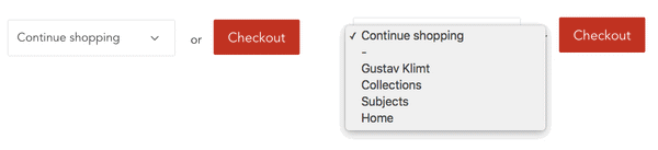
This solves both Problem 1 (where to link to) since we can list as many as are useful, and Problem 2 (an uncertain destination) since each label is explicit.
Importantly, the first link on the list is the last list of specific images you visited. So that could be one of our subjects, an artist collection, or, say, page 7 of a search.
We hope you find this new little feature useful. Feedback is always welcome, and as you can see, we do take it all on board.